Rising Tide Logo Improvements
Neil Patel
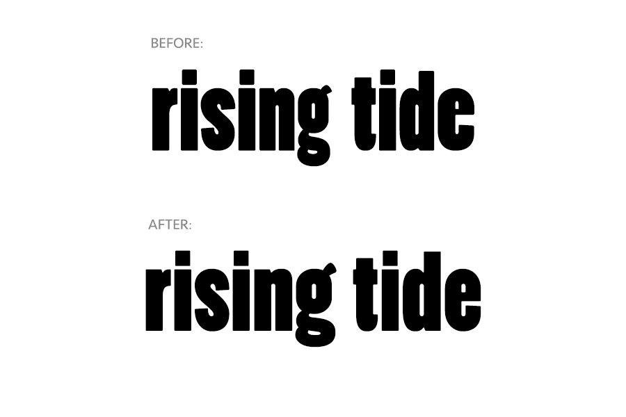
Before and after image of Rising Tide logo
Since 2010, local craft brewery Rising Tide has been producing artisanal small-batch beer which has been widely available in New England on tap and in 22oz. bottles. In 2014 they made the move to have there more popular varieties available in 12oz. 4-packs. To pull it off they hired Might & Main to design the new labels and carriers.
Seeing this as a good opportunity to refine the existing brand Might & Main asked me to fine-tune the logotype. The original logo is set in Poplar, which is also used elsewhere in the brand, primarily for the names of the beer. Poplar is a digital revival of a wood cut typeface designed by William Leavenworth in the early 1800's. Most of the wood type of that time was designed to be used at large sizes and to be eye-catching. There were also the mechanical limitations that prevent from any part of one letter overlapping into the space occupied by another. With all of this often comes some eccentricities that in large bodies of text translate into texture but when setting only one or two words looks awkward. This is due to the lack of repetition in the eccentric features.
In the original logo the most awkward letters are the g and the e. The lower part of the g is dwarfed by the upper making it have bobble-head-like proportions. The e opens up into a large aperture that makes it have a large mouth that clashes with the neighboring letters. If these two letters happened to be in middle of the word it my not be as noticeable but in this case they both occur at the end of the word which makes them stand out more.
Improvements to the letterforms focused primarily on redrawing the g and e to achieve better balance with the rest of the logo. In addition, to those changes stem-widths, counter heights and overshoots were standardized to achieve better harmony.

Comparison of old and new outlines

New 4-packs on store shelves